Layout:
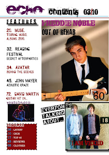
On the contents page there are three pictures making it simple and less crowded. The biggest picture on the right hand side is related to the main story inside the magazine which is to do with Freddie Noble. Below this is another picture of the band 'I Am Vexed' and a small picture just below the features of David Martin. The features is on the left hand side with a regulars box at the bottom of the page. At the top is the title of the page.
Conventions:
Typical conventions have been followed such as the main image being on the right hand side, the features being on the left, a separate regulars box, the masthead, title of the page, date and page numbers.
Pictures:
The main picture of Freddie Noble has been edited so it has three strikes at the top left hand side of picture. This gives the idea that he feels like he is stuck in a prison and can't quite 'see the light' this compliments well with the tag line of "Out of rehab." The other picture of 'I Am Vexed' represents the target audience as in the photo they are standing against a wall with the figure of an 18 next to them. This represents the target audience as they are dressed well, Indie and aged 18 and above. The picture of David Martin with him playing the guitar ties in well with the feature: "David Martin - Guitar Hit."
Font and Colour:
Just like the front cover, the font on the contents page appears to be edgy, rough and bold just like the target audience. The colour of the masthead is a deep red which is different to the front cover, this red warms the page against the harsh colour of black of the 'contents 03/10'. The features are written in black and the same deep red as the masthead, which link the features to the magazine. Freddie Noble is written in a darker pink then what was on the front cover, this gives the impression that he has a warmer personality contrasting to the bold tag line, written in black of "Out of rehab."
No comments:
New comments are not allowed.