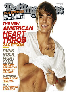
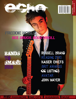
I already knew the specific picture I was going to use, as we had done the photo shoot before we started the planning of our front cover. I used a number of magazine front covers to help me decide on how I was going to layout my page, the colours I was going to use, what typical conventions such as bar code and price I was going to need and where these should be placed.
These are some of the front cover pages and images that I used for inspiration when I was planning my front cover.


From these magazine I started generating some ideas, for my final page. I knew that looking from these front covers that the layout should be:
Masthead on the left hand side.
Main image in the centre.
Different features inside the magazine to mainly be on the right.
Anything else to go on the left.
After my draft, I got feedback from my fellow peers to find out what worked well and what needed changing they advised me to move the text along as "Freddie Noble" was only just on the page and so is the masthead. The red banner and the font inside it needs reducing as it looks to large. I personally though that "Bands to Smash 2010" needed to be more powerful and bolder then it was. My peers also suggested that although they liked the use of the stars it gave it a slightly more unprofessional look about it, which my teacher agreed with. They also liked my use of colour on the fonts especially for "Sex. Drugs. Rock'n'Roll.
You can see my draft front cover on page 27 in my scrapbook.
Unfortunately I lost my memory stick which had the majority of my screenshots on. However, the developments of this can be seen in my scrapbook on page 20 to page 26.

Final front cover - After changes.
No comments:
Post a Comment