This is one of my front covers that I deconstructed. From this I looked at:
- Symbolism: such as why Drew Barrymore has been presented differently then normal and what the rabbit in the image means
- Typical conventions: such as the tag line, masthead, plug and an image. (This magazine actually doesn't follow the normal conventions of music magazine such as there is no date or issue number on the magazine.)
- Colour: Why the dark colours such as purple and black have been used and what this could represent.
- Layout: How the picture has been placed in the centre of the cover, the positioning of writing and masthead and the camera shot
- Images: Only two images have been used but I examined why the rabbit has been used and how Drew Barrymore has been presented.
- Font: I described the type of font and whether this had significant relevance to the magazine and what impact it had on the front cover.
- Target Audience: I tried to determine what Pop's target audience were by the front cover alone. I believe that it is aimed for a young female readers who are interested in fashion and music, aged between 20-30 with a reasonably high income.
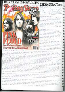
The second front cover that I deconstructed I have scanned in because I followed more conventions I followed more of the conventions of The Rolling Stone magazine as I felt this would be easier to identify my target audience. I have followed the conventions of using plugs to advertise what is in the magazine, the masthead, date, website, bar code, different colours and font and one main tag line to advertise the main feature in my magazine.
 Overall, from this magazine I liked the idea of the amount of symbolism used, I decided to include this in my final front cover but as the darkened picture of my model suggests that he has a darker side to his personality. However I didn't use as much symbolism as this magazine did. I used and developed the convention of the font style and colour as The Rolling Stone have used a simplistic font and colour, just using red, black and white.
 From both of the deconstructed front covers I took conventions from them such as the font from The Rolling Stone and the colouring, from the Pop magazine I took the masthead (obviously changed the name) and the layout of the positioning of the picture and masthead, as my masthead is on the left hand sign with the picture centrally aligned. However, I challenged the conventions of layout of the other plugs and inserted different colouring to vary the cover. I included the typical conventions needed such as the bar code, date and website.
As I was making a front cover, contents page and double page spread, I deconstructed contents pages and double page spreads to get an idea of the conventions.

This is one of the contents page I deconstructed, from this I used the typical conventions to develop my contents page, such as the layout and style of Q, at used the masthead and the title of CONTENTS and included the date. My main feature on my model's picture and the tag line including this was all on the right hand sign with a picture underneath. I continued with the Features on the left hand side too.
I deconstructed a double page spread in which I ended up mainly challenged it's conventions:

This is the double page spread that I challenged all of its conventions because, although I have basically kept the layout the same (this layout is the same through the majority of DPS - image on the left, text on the right) I have challenged the amount of symbolism that is shown in this because I used my text to explain any meanings. I didn't use the same layout for the title and decided to add in a more obvious sub-heading as I felt this would draw in my target audience more.
No comments:
Post a Comment