
Tuesday, 20 April 2010
My Double Page Spread Deconstruction

My Contents Deconstruction
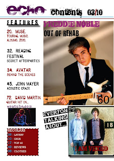
On the contents page there are three pictures making it simple and less crowded. The biggest picture on the right hand side is related to the main story inside the magazine which is to do with Freddie Noble. Below this is another picture of the band 'I Am Vexed' and a small picture just below the features of David Martin. The features is on the left hand side with a regulars box at the bottom of the page. At the top is the title of the page.
Conventions:
Typical conventions have been followed such as the main image being on the right hand side, the features being on the left, a separate regulars box, the masthead, title of the page, date and page numbers.
Pictures:
The main picture of Freddie Noble has been edited so it has three strikes at the top left hand side of picture. This gives the idea that he feels like he is stuck in a prison and can't quite 'see the light' this compliments well with the tag line of "Out of rehab." The other picture of 'I Am Vexed' represents the target audience as in the photo they are standing against a wall with the figure of an 18 next to them. This represents the target audience as they are dressed well, Indie and aged 18 and above. The picture of David Martin with him playing the guitar ties in well with the feature: "David Martin - Guitar Hit."
Font and Colour:
Just like the front cover, the font on the contents page appears to be edgy, rough and bold just like the target audience. The colour of the masthead is a deep red which is different to the front cover, this red warms the page against the harsh colour of black of the 'contents 03/10'. The features are written in black and the same deep red as the masthead, which link the features to the magazine. Freddie Noble is written in a darker pink then what was on the front cover, this gives the impression that he has a warmer personality contrasting to the bold tag line, written in black of "Out of rehab."
My Front Cover Deconstruction

Font and colour:
The font on all of the writing that has been used is quite edgy and is rough around the edges. This is representative of the target audience because they are not totally clean cut and have a rougher and edgy side to their personalities.
The masthead is written in white, representing the innocence and slight ignorance which is again, representative of the target audience for the magazine because although they have a rougher side to them they are also caring, and more innocent then they seem. The rest of the colour font in the plugs are a mixture of either purple and white or blue and white. The white has been used to connect the plugs to the masthead and the magazine while the other fonts give the front cover a varying and original look, just like the target audience.
The main plug of "Freddie Noble" etc has been written in grey for his name and pink for the sub-heading underneath his name this separates it from the other plugs and gives the idea that this is the main story inside of the magazine. The pink has been used, despite feminine connotations, gives Freddie a slightly softer side instead of the rough and slightly threatening side that is portrayed.
Conventions:
The conventions that have been used are necessary for all magazines, there is a bar code, date, price and website for the target reader to access.
Picture:
There is only one main picture on this front cover, this is of Freddie Noble. The picture is typical for a music magazine and for front covers in general. The subject is in the centre of the page looking straight at the reader themselves. This gives a direct appeal to the target reader enticing them to buy the magazine. Freddie is wearing a suit giving him the image of someone that is sophisticated and hard working but because of his slightly aggressive facial expression is follows the conventions of gangsters in earlier films such as The Godfather. This presents Freddie to have a darker nature and personality. Freddie is on his knees with a guitar in his hand resting next to him presenting his passion for music and his career.
Monday, 12 April 2010
My Double Page Spread (DPS)
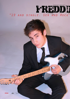
 This is my final double page spread, the draft and screen shots showing the development of this page can be found in my scrap book on pages 42 - 49.
I found this page the easiest to plan and develop, probably because I had more experience when using the software. I still however, used a magazine double page spread for inspiration so I could plan how I wanted to arrange the layout for my own double page spread.
This double page spread from 'NME' music magazine was my inspiration for my DPS as it used good styles to attract the reader such as the simple layout, tag line from the interview itself and a strong pose from the singer.
Once I had completed my draft DPS my peers looked over it and suggested what needed improving and changing, they suggested changing the font colour back to all black at the start as it looks unprofessional, and for the picture of Freddie his foot needs to be cropped out of the picture, which will make it look more professional. My peers liked the page number and website at the bottom of the page.
Saturday, 10 April 2010
My Contents Page
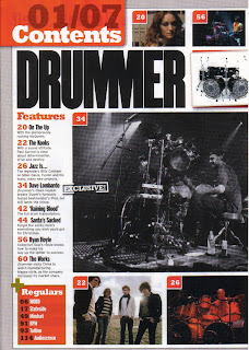 For this page of my magazine I decided to use a contents page from NME because I liked the simplicity of it and thought that the style would fit in well with my magazine. In my scrap book, I used a contents page that I saw as 'inspiration' as I decided to copy some of the styles, layout and colour it had used to present the contents page, obviously I made this more original and made it more applicable to my style and genre of music magazine. From this I planned a basic outline of my contents page.
Once I had finally finished the draft of my contents page I asked my fellow peers what aspects they liked of the page and what needed changing or getting rid of all together. For my contents page I was advised to change the editing on Freddie's picture so it was lighter and the font needs to be more bold and eye catching. They liked the 'I am Vexed' picture and how I've introduced them.
Sunday, 4 April 2010
My Front Cover
I already knew the specific picture I was going to use, as we had done the photo shoot before we started the planning of our front cover. I used a number of magazine front covers to help me decide on how I was going to layout my page, the colours I was going to use, what typical conventions such as bar code and price I was going to need and where these should be placed.
These are some of the front cover pages and images that I used for inspiration when I was planning my front cover.

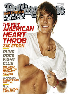

From these magazine I started generating some ideas, for my final page. I knew that looking from these front covers that the layout should be:
Masthead on the left hand side.
Main image in the centre.
Different features inside the magazine to mainly be on the right.
Anything else to go on the left.
After my draft, I got feedback from my fellow peers to find out what worked well and what needed changing they advised me to move the text along as "Freddie Noble" was only just on the page and so is the masthead. The red banner and the font inside it needs reducing as it looks to large. I personally though that "Bands to Smash 2010" needed to be more powerful and bolder then it was. My peers also suggested that although they liked the use of the stars it gave it a slightly more unprofessional look about it, which my teacher agreed with. They also liked my use of colour on the fonts especially for "Sex. Drugs. Rock'n'Roll.
You can see my draft front cover on page 27 in my scrapbook.
Unfortunately I lost my memory stick which had the majority of my screenshots on. However, the developments of this can be seen in my scrapbook on page 20 to page 26.
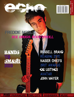
Final front cover - After changes.
Monday, 29 March 2010
Technologies Learnt From Construction
'Photoshop':
This was used to edit the pictures, adjust the auto colours and background - to make it lighter and darker or to add gradients. As I had no past experience on using 'Photoshop', everything was new to me. This meant I had to learn how to edit out spots and blemishes by using the spot remover to make a more even complexion, one of the most important things I learnt. How to change the background colour and lighting - using auto selection and colour. These were the two main things that I was taught, but when on my own and playing around on 'Photoshop' I managed to teach myself how to change the gradient, lighting bounce - changing the angle of lighting, and adding colour to the lighting which gave my pictures a different feel. I didn't come across that many challenges when using this software as I made sure I gave myself plenty of time, before we came to edit the pictures, to get used to 'Photoshop' and the different tools in it.
This was were I developed the front cover, contents page and the double page spread. Again, I had no past experience on using this software and was taught first how to insert picture, (box tool, file and place) insert font, change the colour and adjust the picture so it would fit the intended space. I struggled with this software more than I did 'Photoshop' as I felt it was more technical than 'Photoshop'. I struggled with changing the colour of the font, in swatches and getting different swatch colours, I also struggled with placing the pictures correctly, as I didn't understand properly how to get the picture to fit in the space I wanted, it was always to large or to little. Due to these problems, I spent many of my free lessons working on 'InDesign' and giving myself more time to develop my pages. On my own I developed certain skills such as how to add effects to the writing such as giving it shadows, slanting pictures and font and got to grips with adding new swatches.
Over the course of making and developing my pages I had a total of 2 Photo shoots. My first one was with Freddie Noble, the main subject of my magazine and who appears on all 3 of the pages. This Photo shoot was taken with proper lighting using a DSL Camera. As I have only used one of these for a picture in the Pre-Lim, it took me a bit of time getting used to it, and being able to focus and position the camera without a stand as it was very heavy. After a bit of time I got used to it and my teacher taught me how to get good positioning and aim properly. From this experience I had another Photo shoot out of college during half term, because I knew how to aim and get the most out of a picture I was able to get a few high quality pictures which I used in my contents page.
What Media Institution Might Distribute My Magazine
www.bauermedia.co.uk
My magazine would fit into this certain publisher because they publish such magazine like, Empire, Kerrang, Mojo and Q. I feel that my magazine fits in well with this because I followed mainly the same conventions as Q magazine and felt that this was the type and style of magazine I was going for. With all of them music magazines I feel that they target the same type of male audiences that I do, which leads me to believe that this would be the best publisher for my magazine.
Also this magazine publisher has a section of what they publish for "Men's Entertainment." This consists of Arena, Arena Homme Plus, FHM and Zoo. The published entertainment would be applicable to my target audience, as I have aimed it for males in their late teens or above. This publisher would defiantly would be the one that would distribute my magazine as all of their magazines they publish have the same intended target audience.
As my magazine is aimed at quite a large target audience which could easily be branched out (as females and others may buy it) my magazine would probably be sold in more mainstream retailers such as WhSmiths, HMV etc.
The magazine that has the most similar name as my magazine would be NME. This magazine basically has the same/similar target market too. NME circulation figure is 40,948. This figure is around about the expected circulation figure if my magazine was on the market.
To collaborate with my magazine I would offer an online version of my magazine, which would include some of the things that are included in the paper version of the magazine, as I obviously would still want my target audience to buy my magazine.
Online Magazines:
http://www.qthemusic.com/
http://www.rollingstone.com/
http://www.nme.com/home
From looking at these actual magazine websites I would include in mine:
The latest music news.
Reviews.
Up comings concert and tickets.
Blogs.
ECHO Radio.
Track Listings of songs which change every week.
Photos.
Latest Movies.
Progression From College Magazine to Full Product
"For the music magazine I will defiantly need to plan a lot more and get more research done, so I can understand music magazine to a good level, I will also produce a draft for my music magazine to make sure that I can present this magazine to the best understanding and ability. I will follow certain ideology but be sure to make it original and more unique than the Pre-Lim magazine I have made. I will also spend more time on Photoshop and InDesign to get a better understanding of both of the soft wares so when it comes to designing my real music magazine I will be able to do it easily."
Overall, I have defiantly accomplished the targets I set, I spent a lot of time planning and researching into different music magazines, which was shown through my deconstructions of front covers, contents pages and double page spreads. The deconstructions that I did in my scrapbook for the front covers I made to a very high standard as I knew that I had to understand the ideology and iconography of a front cover more than anything. However, for the contents pages and double page spreads, although a decent amount of effort went into this I feel I did not complete these deconstructions to the best of ability which in result led to me not understanding these pages as well as the front cover. If I had focused more on the deconstructions of the contents pages and double page spreads, I could have probably achieved a better standard of my own pages.
As for researching, I also believe that I did this to a better standard than I did in my Pre-Lim. From the evaluation and my scrap book it is clear that I did spend a lot of time looking into the particular items that my target audience would like which was shown through the mood board, I made a questionnaire especially aimed at my target audience so I would know exactly what they would want to see and read in a music magazine. I also looked into more magazines of my particular genre to get a better understanding of what they include in their magazine giving me a wide range of options when considering what to put in my magazine and the layout.
As for the planning side I believe I could have put more effort in to get the optimum best out of my pages. I don't think I planned that well, mainly because I was more interested in getting actually started on my draft and final pages than I was planning, because I was aware of the deadline that was getting increasingly closer. The planning that I did was the basics of my pages, however I think from showing where I got my inspiration was a good idea as it allowed me to remain focused on what I did want in my pages and not get sidetracked with adding in things I didn't need.
After my Pre-Lim I wrote in my evaluation on the construction side of the pages was:
"When first introduced to InDesign and Photoshop I had never used them before and therefore had to pick up the skills as I went on. From this I have managed to grasp a basic understanding of Photoshop and InDesign and can use different skill such as: I know how to place a picture on both of these soft wares, change different colours and textures, place writing and text and add interesting features to them to make it more appealing. In Photoshop I now understand how to edit a picture and change anything to it that is not needed such as, resizing a picture, zooming in and out, changing the texture and removing blemishes and uneven skin tone."
"If I did the Pre-Lim task again, I would have spent more time editing the picture and focusing to make the front cover and the contents page a lot more detailed and less basic, however lack of time prevented me from doing this already. I would also change the background to my front cover and make it more interesting with a better font and different effects skills such as using different textures to create something more different and original. The contents page does follow some ideology but I think I would need to look at other magazines more throughly to produce a better contents page with more understanding."
Overall, I think the construction of all my pages went a lot more smoothly then when I did the Pre-Lim as I was more knowledgeable and understand InDesign and Photoshop a lot more which gave me the advantage of being able to edit to a high enough standard and let me construct the type and style of pages that I wanted. I also mentioned in my Pre-Lim that I would need to work on ideology and to focus on magazines more, which I did do giving me an advantage when it came to the construction of my pages. All of my pages follow a specific page from a music magazine so I could ensure the layout and style was correct and from being able to edit and using this, I think I managed to achieve the best potential of my pages.
Over the year I have had to learn a lot of new skills in a short space of time and some of these skills improved greater than others, such as my deconstruction skills and researching. I think my deconstruction skills developed highly as I find it easy to learn new key words for this and find symbolism etc easy to spot whereas when it comes to planning for instance I always am quite indecisive which is why this skill took longer to develop and not to the best that it could have been. The main thing I would have changed when undergoing this task would have been to give myself more time planning and working on the scrapbook and putting a good effort into every page as I feel that some pages are or a lower quality then others.
Saturday, 13 March 2010
Target Audience for Magazine
I decided on this type of person as my target reader because I personally prefer the more original and less conventional style of magazine, however by making it more appealing to the male gender requires much more research into what they like/enjoy and look for when buying a music magazine. I also chose this target audience because it opened up more opportunities/ideas for the photo shoot and front cover as it allowed me to break some of the usual conventions that are typical for a music magazine.
What represented my target audience best and what their interests are and what probably helped me the most when developing my pages was my psychological profile as although this was basic and a generalised version of what my target reader was interested in, it gave me loads of ideas for each different page, photo shoot and editing and the style I wanted.
Tuesday, 9 March 2010
How I Attracted My Target Audiences
A music magazine follows in the same way, aiming to attract certain people through the type of music, advertisements, price etc.
From the start I knew I wanted to aim my music magazine at young males, with a reasonable income/students into the Indie style of music.
To get an idea of what this target audience would look for in a magazine I conducted a questionnaire to work out, what would attract them to buy the magazine, the pricing and what bands and other articles and information they would look for in a magazine.
Here are the questionnaires I asked:
Key: 1-10 refers to the number of people.
Do you buy magazines on a regular basis? (e.g. every other week)
Yes: 7
No: 3
What age category are you in?
Below: 1
15-25: 6
26-35: 2
36-45: 1
Above:
Do you tend to buy magazines that are monthly or weekly?
Monthly: 8
Weekly: 2
What genre of music do you enjoy listening to at the moment?
Rap/Hip-Hop: 2
Dance: 1
Pop: 2
R'n'B:
Indie: 4
Rock: 1
Do you tend to listen to one genre or a range?
One genre:
Range of genres: 10
Currently what is your favourite band or solo artist?
1: Kings of Leon
2: Muse
3: Muse
4: Coldplay
5: Kings of Leon
6: Muse
7: Alicia Keys
8: Arctic Monkeys
9: The Enemy
10: 30 Seconds to Mars
In a music magazine would you rather have a range of other topics such as film and fashion?
Yes I'd like a range: 7
No, I would not: 3
How much would you be prepared to pay for a music magazine?
£3: 4
£4: 5
£5: 1
Would you like to see in the magazine....
Just bands you're into: 1
Just different bands: 2
Bands that you like and different bands: 7
What magazines do you currently buy?
1: NME
2: Q
3: Q
4: NME
5: NME
6: Rolling Stones
7: Clash
8: Rolling Stones
9: Q
10: Rolling Stones
What radio stations do you listen to?
Kiss 100:
Capital 95.8: 2
Radio 3:
Absolute Radio: 1
NME Radio: 2
XFM: 4
Other:

This psychological profile of my target readers suggest all of what they enjoy doing and what they’re interested in, from this and my questionnaire it made me able to construct my magazine to specifically to what my target audience wants, likes and enjoys.
As I knew that my target audience enjoyed nights out, drinking, women and sex I made my Double Page Spread story solely around these things, which is an interview on Freddie Noble and how he’s enjoying life as a attractive celebrity. To attract my target audience to the story in particular I used a tag line to encourage them to read it:
“19 and Single. Sex and Rock’n’Roll? Who wouldn’t say no?!”
This would have drawn my target audience into my double page spread, as for my contents page I made it so it appeals for my target audience by making all the features to do with what they liked and enjoyed doing such as information of Reading Festival, Muse and Avatar – this was the main way I attracted my target audience to via the front page of my magazine as I included what features were in the magazine which would have encouraged them to buy the magazine. Also on my contents page, I included more images, one of another band and a solo artist. This would have attracted my target audience to this and made it more applicable because the band photo was obviously quite Indie due to their style and clothes which represent my target audience, and the other picture of a solo artist playing at what looks like a concert would have appealed to them because my target audience likes nights out, concerts and festivals.
I think I have been mainly successful making my magazine pages applicable to my target audience as I have focused in on what they like and made sure to include that in my pages, especially my contents and double page spread. I think I should have focused a lot more in making my front page appeal to my target audience as although it is, it doesn’t sell itself to the target audience as much as I wanted to do. The features on my front page to refer to what my target audience like and enjoy doing but I feel I could have made this stronger by advertising more aspects of what they like doing on the front page, making it appeal more to my target audience.
Wednesday, 3 March 2010
Forms and Conventions.

This is one of my front covers that I deconstructed. From this I looked at:
- Symbolism: such as why Drew Barrymore has been presented differently then normal and what the rabbit in the image means
- Typical conventions: such as the tag line, masthead, plug and an image. (This magazine actually doesn't follow the normal conventions of music magazine such as there is no date or issue number on the magazine.)
- Colour: Why the dark colours such as purple and black have been used and what this could represent.
- Layout: How the picture has been placed in the centre of the cover, the positioning of writing and masthead and the camera shot
- Images: Only two images have been used but I examined why the rabbit has been used and how Drew Barrymore has been presented.
- Font: I described the type of font and whether this had significant relevance to the magazine and what impact it had on the front cover.
- Target Audience: I tried to determine what Pop's target audience were by the front cover alone. I believe that it is aimed for a young female readers who are interested in fashion and music, aged between 20-30 with a reasonably high income.
The second front cover that I deconstructed I have scanned in because I followed more conventions I followed more of the conventions of The Rolling Stone magazine as I felt this would be easier to identify my target audience. I have followed the conventions of using plugs to advertise what is in the magazine, the masthead, date, website, bar code, different colours and font and one main tag line to advertise the main feature in my magazine.
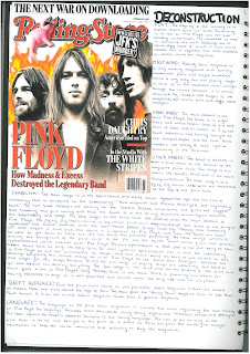 Overall, from this magazine I liked the idea of the amount of symbolism used, I decided to include this in my final front cover but as the darkened picture of my model suggests that he has a darker side to his personality. However I didn't use as much symbolism as this magazine did. I used and developed the convention of the font style and colour as The Rolling Stone have used a simplistic font and colour, just using red, black and white.
I deconstructed a double page spread in which I ended up mainly challenged it's conventions:


